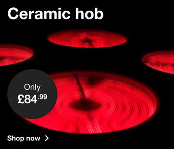
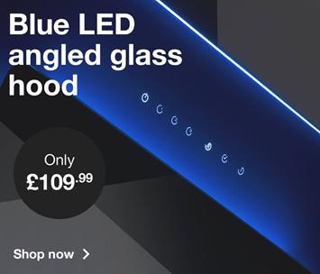
Create image banners and assign them to groups to form neat layouts and prioritise feature banners to stand out within a group.
Create image banners and assign them to groups to form neat layouts and prioritise feature banners to stand out within a group.
Full Width Layout
Full width layouts span the full width of the main container.

Double Square Layout - Example 1
Double square layouts must include 2 half square banners to display correctly at different breakpoints.



Double Square Layout - Example 2


Grid Square Layout - Example 1
Square layouts must include multiples of 6 square banners to display correctly at different breakpoints. You can also use 1 or 2 square banners combined with 2 or 4 half square banners respectively as shown in examples 2-4.
Pro tip: If required you can have just 3 square banners side by side. Please note that when displayed at SM viewport they will become 2 and 1 leaving a blank space to the right of the 1. Use this approach at the end of a banner group for a neater layout.
Grid Square Layout - Example 2


Grid Square Layout - Example 3


Grid Square Layout - Example 4


Grid Half Square Layout
Half square layouts must include multiples of 6 banners to display correctly at different breakpoints.
Pro tip: If required you can have just 3 half square banners side by side. Please note that when displayed at SM viewport they will become 2 and 1 leaving a blank space to the right of the 1. Use this approach at the end of a banner group for a neater layout.
